3 Azure Monitor hidden gems you should use
Azure is full of hidden gems which makes your life easier, here are some I discovered which I find useful


TL;DR - Azure is full of hidden gems which makes your life easier, here are some I discovered which I find useful.
Azure Monitor is a fundamental service which, hopefully, everybody uses to operate their applications, its infrastructure, scaling, health and more.
One of the Monitor cornerstones are metrics - They are the basis of building an operable system hosted by a cloud provider:
- They allow you to explore how everything is running
- Create dashboards which serve as a single-pane-of-glass overview
- Be alerted when certain thresholds are met to notify people, automatically mitigate actions and more
- ...
Today I'd like to share some hidden gems which I find useful and have only discovered recently or brought to my attention which makes things a lot easier.
1. Automatically Deploy Dashboards
Having metrics is one thing, consuming them in a productive way is a different story - This is where dashboards come in!
They allow you to very easily create and share a centralized view of all your (most important) metrics that give you a quick overview of how your environment is doing.
One thing I've been struggling with is not creating them, but keeping them up-to-date across multiple environments.
Turns out you can export your dashboard into JSON and deploy it via Azure Resource Management (ARM).
This allows you to build a consistent dashboarding experience and automatically deploying it along with your platform and its underlying infrastructure!
To be fair, it's still a bit cumbersome given the dashboard JSON contains a lot of resource URIs to tweak but it's definitely a good start!
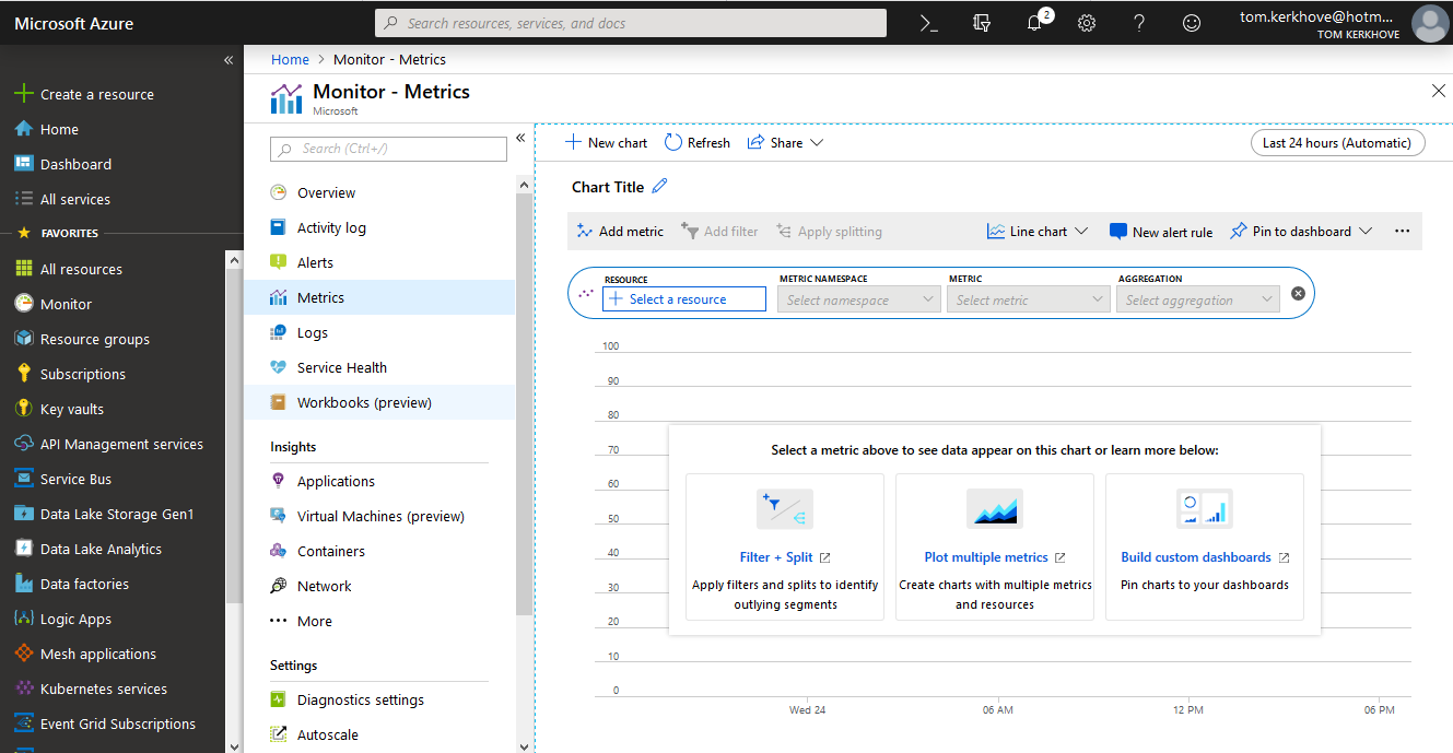
2. Share Graphs in Metric Explorer via Deep Links
Azure Metric Explorer is a great way to plot metrics into a graph or a table during investigations. The difference with dashboards is that I tend to build those up during analysis to get an understanding of what is going on.
You can very easily get started with this:
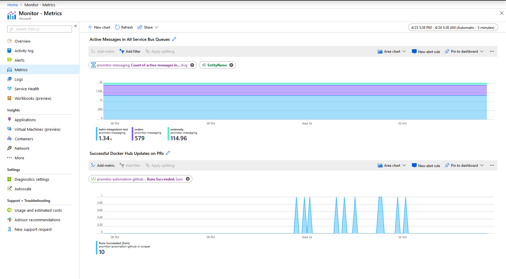
As you go deeper into the analysis, you need to consume the data more granularly by filtering out noise or splitting metrics to get a clearer overview.
I do this a lot as I'm a big fan of doing Root Cause Analysis (slide 45) when things go haywire as it forces you to rely on your instrumentation and what the platform provides you.
During that process, I create one overview with all the graphs that I think are relevant and take screenshots of them.
Here is an example of what it could look like:
Turns out there is even a better way! You can generate a deep link which allows you to share your charts which includes the metrics, filters, splitting and time period.
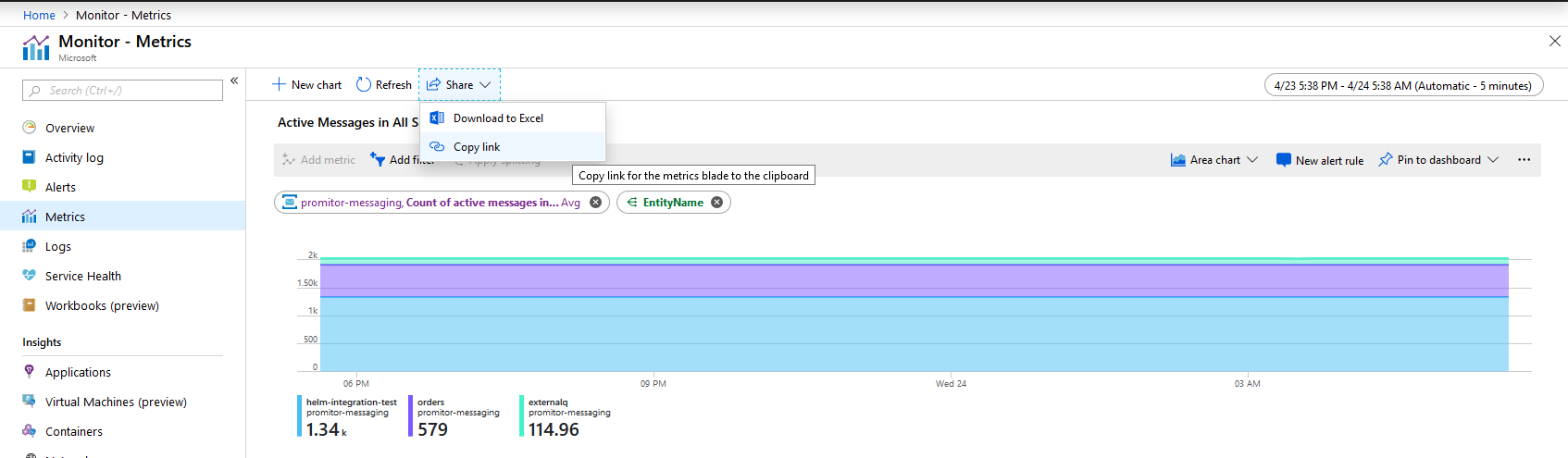
This is a great way to allow you to go back to a given chart by including a link to your charts as part of your RCA report.
3. Get An Overview Of All Supported Metrics
For Promitor I've been working with the Azure Monitor REST API lately and one of the hardest parts is figuring out how to query it.
My good friend James Sturtevant pointed me to a full list of all metrics that are supported in Azure Monitor - You should definitely bookmark this page!
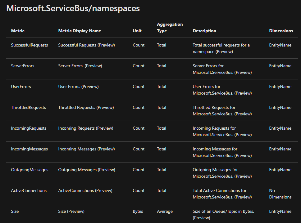
The page does not only allow you to see what metrics are available but also what aggregation they support, what the units are, what it represents and which dimensions it exposes.
Conclusion
Metrics are an underestimated aspect and unfortunately not every Azure service provides as much metrics and insights as we would like to have.
However, you can always go to UserVoice and provide feedback on the metrics you'd like to have!
Hopefully, these small tips above help you build an operable system and allow you to sleep peacefully at night!
How are you using metrics? Which ones do you think are lacking?
Thanks for reading,
Tom.
Splash image by Markos Mant